
Deliverables:
Logo Refresh
Brand Guide
Website Redesign
Print Collateral
Acquisition:
by American Efficient in 2018
Plotwatt designed and developed a web-based platform that focuses on energy analytics allowing its clients to track and analyze their energy usage data. The company finds its highest returns in the quick service industry including chains like Wendy’s, KFC, and Dunkin’ Donuts. Their algorithms convert the energy use data into actionable insights for their clients who can not only can see an immediate return of 15% electricity savings, but also a roadmap to a metered energy efficient program saving even more over time. Seeing a surge in growth, Plotwatt needed a refreshed logo, unified brand standards, a site redesign, and marketing print collateral.
Logo Refresh
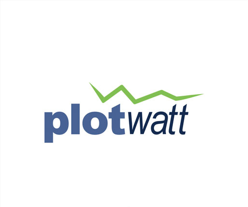
Original Logo
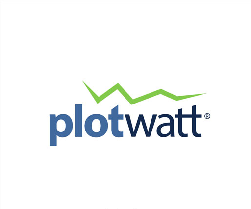
Refreshed Logo
The foundational concept of the existing Plotwatt logo was strong and had worked well for the company since 2007. Seeing an opportunity to solidify the branding, Ray and his team made minor adjustments that would give the brand a strong foundation. Font substitutions allowed for a better balance within the mark’s two words. Alterations to the ascenders in the double “t” allowed the electricity icon to interplay with the letterforms, reflecting their angles through the negative space. Lastly, the logo’s color saturation was increased just slightly for the final pop.
Brand Guide
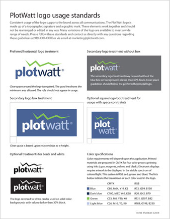
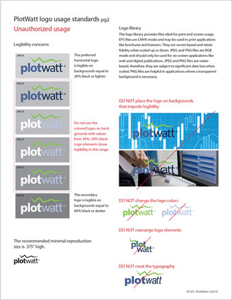
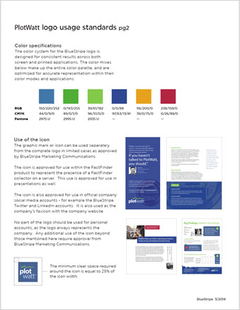
After refining the Plotwatt logo, the next phase involved extending the brand system. Defining secondary colors and type styles enabled the use of a much larger set of design elements while keeping the brand unified. Print and web considerations were added as references and were the foundation for later efforts. Usage standards and alternate logo treatments rounded out the last deliverables in the guidelines.
Website Redesign
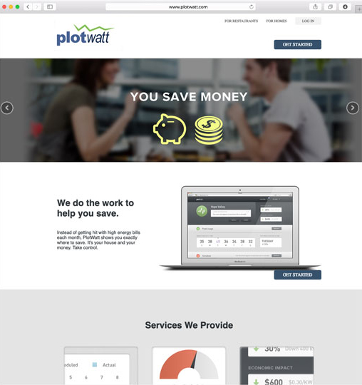
Original Website
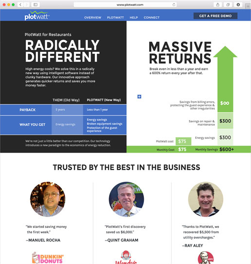
Redesigned Website
Using the new brand standards, the site redesign extended Plotwatt’s brand through a new online build. Moving away from the previous site’s rigid template structure, the new UI of the site focused on validating and quantifying return on investment, and calls to action. Infographics and charts further reinforced the new brand standards and created actionable next steps. This build also included an interactive landing page, animating the typical client issues through a stylized generic quick serve restaurant.
Print Materials
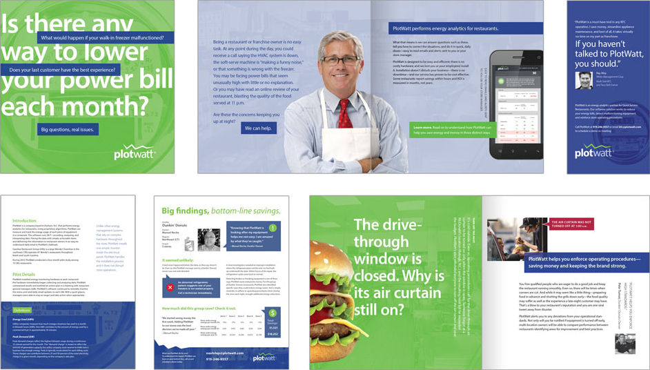
Plotwatt also looked to create a unified print campaign as handouts and leave behinds were a core element of their sell cycle. Deliverables included booklets, sell sheets, brochures, and testimonial flyers. All deliverables were based on the design standards established in the earlier phase; any further-refined design elements from this set were added back to the standards guide for future reference.