Deliverables:
Logo Redesign
Brand Ecosystem
Website Redesign
Stratyfy’s co-founders envisioned a new approach to AI-based decision making – one where AI-enabled data insights and human understanding were combined to embrace the complexity of an uncertain market. Implementing easy-to-use, explainable, and transparent AI solutions, Stratyfy is focused in reducing financial risk, eliminating bias, and giving their client clear data to make sound decisions.
However, their existing branding created more risk than resolution with potential clients. Stratyfy reached to RPcd to establish a brand that validated their capabilities and established their credibility in the fintech sector. With an accelerated timeline, RPcd kicked off user interface while reinventing their core brand elements. Refinement to the logo was simultaneously iterated while designing homepage elements in the form of art objects. Within 4 weeks, RPcd had finalized the new brand and homepage design with a one page site development launching shortly afterwards. Strategic subsequent phases continue to allow the site evolution adding interior pages, secondary nav items, and a news/blog.
Logo Redesign
Original Logo
Redesigned Logo
Stratyfy’s existing brand elements did little to standout in a crowded field. Competitive analysis revealed the need to move away from overused fonts and softer tones to create more vibrant branding that reflected the exciting capabilities of this growing fintech. Since their clients turn to Stratyfy to predict financial uncertainty, the new branding created a visual metaphor of their layered approach to mitigating risk. A variety of colored bars move through the icon, slowly reducing space and variables as they are vertically assembled. A customized font with blended letter forms create continued visual flow and movement through the entire logo. Both the visual strata elements and the customized workmark could be used independently across marketing deliverables.
Brand Ecosystem
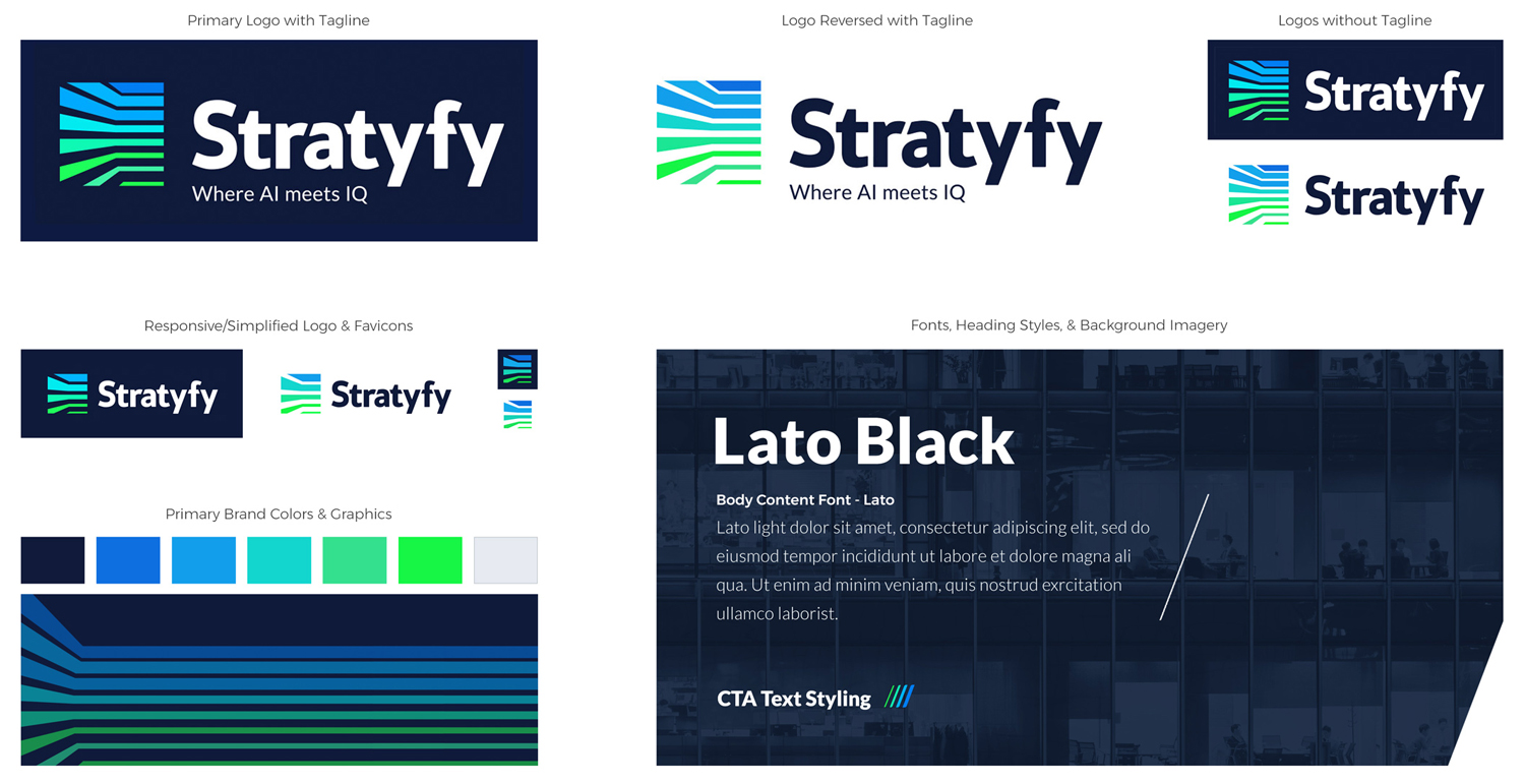
Once the logo had been defined, an ecosystem of design elements were created to ensure the brand stayed consistent throughout all use cases. Secondary logo treatments, one-color options, favicon, and even responsive/simplified versions were all established. The brand’s color system and font specifications rounded out the abbreviated guidelines and gave future design work parameters to keep all visuals and messaging uniform.
Website Redesign
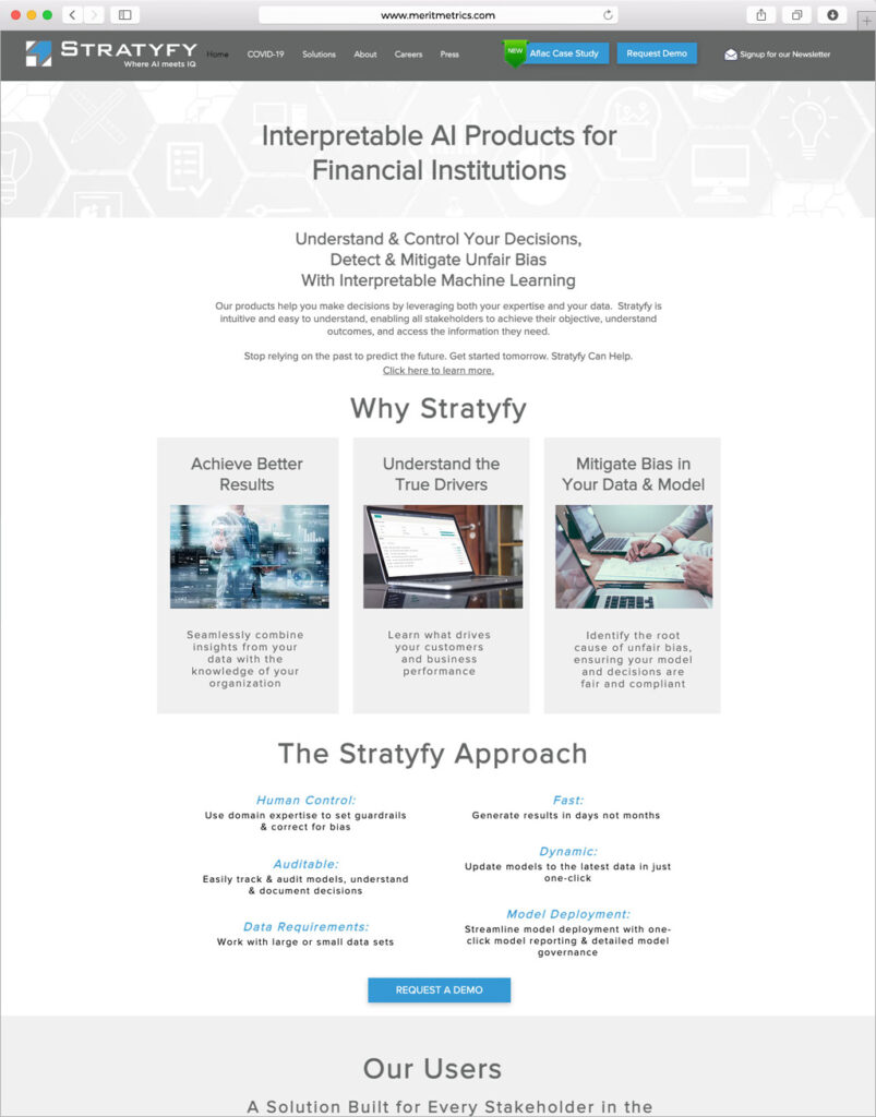
Original Website
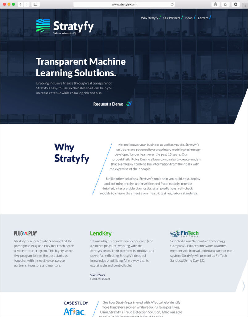
Redesigned Website
Since Stratyfy had a very aggressive timeline to launch their new brand, an agile approach was decided upon. A one-page site design and build took just under a month to launch. Quick pivots allowed their team to add new feature sets to the existing page while further development of the interior pages was being planned out. Subsequent launches included a dedicated about page, secondary navigation solution offerings, and a blog. Check back for further site development as it evolves.